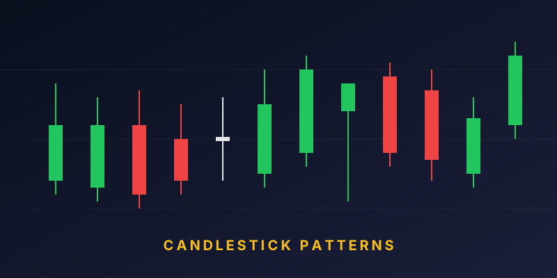
Candlestick charts are one of the most popular ways to visualise price movements in the stock market. Developed in Japan over 300 years ago by rice traders and popularised in the West by Steve Nison, candlesticks pack a lot of information into a simple, easy-to-read form. This guide walks you through the basics of reading them.
What Is a Candlestick?
A single candlestick shows four prices over a specific time period: Open, High, Low, and Close (OHLC). Each candle summarises what happened during that period — a minute, an hour, a day, or a week, depending on the timeframe of the chart.
Anatomy of a Candlestick
A candle has two main parts:
- Body — the thicker rectangular part. It shows the distance between the opening and closing price.
- Wicks (also called shadows or tails) — the thin lines extending above and below the body. They show the highest and lowest prices reached during the period.
Green vs Red (Bullish vs Bearish)
Two things tell you whether a candle is bullish or bearish:
- Green (or white) candle: Close is higher than Open. The price went up during this period. This is bullish.
- Red (or black) candle: Close is lower than Open. The price went down during this period. This is bearish.
Think of the body as the tug-of-war winner: if buyers were stronger, the candle is green. If sellers were stronger, it is red.
What the Wicks Tell You
The wicks show the extremes of the period — the highest and lowest prices touched. A long upper wick means prices tried to go higher but sellers pushed them back down. A long lower wick means prices tried to go lower but buyers stepped in.
Common Candlestick Shapes
1. Long-Body Candle
A candle with a large body and small wicks shows strong momentum. A long green body means aggressive buying; a long red body means aggressive selling.
2. Small-Body Candle (Spinning Top)
A small body with wicks on both sides shows indecision. Buyers and sellers were roughly balanced.
3. Doji
A Doji is a candle where the open and close are almost identical, resulting in a nearly non-existent body. It signals a pause and often precedes reversals when it appears after a strong trend.
4. Hammer
A candle with a small body at the top and a long lower wick, usually seen at the bottom of a downtrend. It signals that sellers pushed prices down, but buyers regained control.
5. Shooting Star
A candle with a small body at the bottom and a long upper wick, usually seen at the top of an uptrend. It suggests that buyers ran out of steam and sellers took over.
Timeframes Matter
The same candlestick can look very different on different timeframes:
- Daily chart: Each candle represents one full trading day.
- 1-hour chart: Each candle represents one hour of trading.
- 5-minute chart: Each candle represents 5 minutes — used by intraday traders.
Longer timeframes tend to give more reliable signals, while shorter ones produce more noise.
How to Actually Use Candlesticks
Reading a chart is about looking at the story, not a single candle. Ask yourself:
- What is the overall trend? Are the highs and lows moving up, down, or sideways?
- Where is price relative to key levels? Look at support and resistance areas.
- What do the last few candles show? Momentum, hesitation, or a possible reversal?
- Does the volume confirm the move? Big candles on high volume are more meaningful.
Practical Tips for Beginners
- Start on a daily chart to build intuition, then experiment with other timeframes.
- Do not act on a single candle — look for confirmation from the next candle or a broader pattern.
- Combine candlesticks with support/resistance and volume for stronger signals.
- Practice reading historical charts before trading real money.
Final Thoughts
Candlesticks are not a magic tool, but they are one of the most efficient ways to understand what buyers and sellers are doing in real time. Learn the anatomy first, then move on to patterns and combinations. Over time, chart reading becomes second nature — and a powerful skill for any investor or trader.